CCV Video Directory
The CCV Video Directory project aimed to improve how teams access and explore video content within the CCV brand ecosystem. The current workflow caused inefficiencies: users wasted time sharing individual file, struggled to find context for videos, and had inconsistent visual presentation. My role focused on research, design, and prototyping, ensuring the platform was efficient, discoverable, and aligned with CCV’s brand guidelines.
Website Design
UX/UI Designer
4 Weeks
Solo Project
About CCV
What was the problem?
To ensure brand consistency, CCV shares its brand guidelines along with existing content references for external agencies to follow. Currently, the workflow relies on manually generated reference links and lacks a centralized knowledge base for managing historical video assets, making it a repetitive step each time a new project begins.
Key challenges
Existing assets are underutilized due to a lack of accessibility
Then what are the goals?
🧐
Streamline video discovery, browsing, and sharing
⚙️
Provide and standardize clear documentation for each video
✨
Enable efficient workflow for both internal teams and collaborators
🌎 Research & design exploration
Key activities in this stage:
Conducted interviews with 5 internal stakeholders to understand workflow challenges
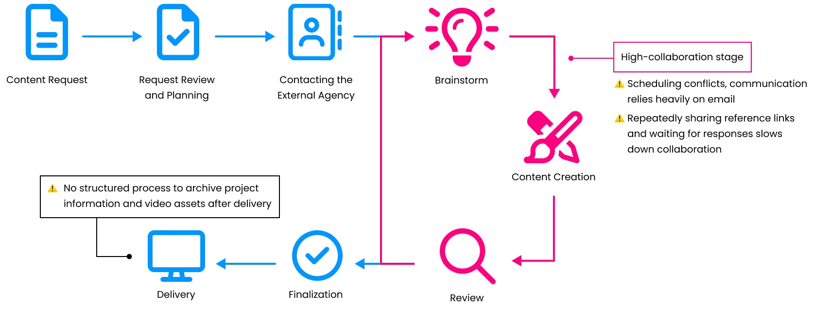
Mapped existing workflow to highlight friction points
Defined priority user tasks to inform navigation design
Benchmarked existing platforms to identify best practices in metadata structure and content discovery
Research and benchmarking
To understand the current collaboration workflow and identify key pain points and user tasks, I conducted workflow observations with the CCV team.
Current Workflow and Collaboration Challenges
I also analyzed platforms such as YouTube, Amazon, and Bynder, focusing on how they structure metadata and navigation to support efficient content discovery.
Key finding
Design Action
Familiar layouts and interaction patterns improve usability
Apply familiar card-based layouts for videos to make browsing intuitive
Text-heavy information makes it harder for users to quickly scan video content
Use visual thumbnails, icons, and short summaries to make video content easier to scan
Metadata helps users quickly scan content and determine its relevance
Highlight metadata such as category, title, and date to support faster evaluation
The initial design

✏️ User Testing and Design Iteration
Key activities in this stage:
Performed usability tests with 2 CCV internal employee and 1 external agency designer
Gathered qualitative feedback from users to identify pain points and improve flows
Iterated prototype based on observed navigation pain points
Testing and result
The prototype was tested with CCV’s internal team and one external agency to evaluate how effectively users could browse, find, and understand video content. Observations focused on navigation, scanning efficiency, and comprehension of metadata.
Key findings and the implication for design:


User Flow Adjustment
Insight
Users needed multiple steps to access specific videos. Additionally, unrelated recommendations interrupted category browsing, slowing down navigation and making it harder for users to find relevant content.
Design action
Replaced the homepage with a video list view, enabling users to start browsing content immediately.
Introduced a burger menu for category navigation to provide a consistent and scannable way to move between video categories.
Metadata Adjustment
Insight
The upload date metadata was irrelevant for users when scanning content, and the cluttered card hierarchy caused fatigue and slowed comprehension.
Design action
Removed unnecessary metadata to reduce cognitive load.
Reorganized the card layout to highlight the video category immediately after the thumbnail, making key information easier to scan.
Visual Hierarchy Improvement
Insight
Users struggled to quickly scan and identify important information in a text-heavy layout.
Design action
Improved visual hierarchy through refined typography and spacing, while adding icons and color accents to make key metadata easier to identify.
Design System Application
Designed according to CCV brand guidelines to create consistent visual language and usability across all touchpoints.
✏️ Final Design
Based on insights gathered from usability testing of the previous design, I redesigned the layout to better align with users’ expectations and behavioral patterns identified during testing
Simple, functional, and built for quick content search


This project strengthened my ability to design within a design system and iterate based on user insights. By working within strict guidelines, I developed a design that is on-brand and helps users explore and access content more efficiently.